Margin of Σrror

Margin of Σrror -

For It While They Were Against It

Sometimes, people respond in strange ways to survey questions.

For a recent project with Jim Stimson and Elizabeth Coggins, I spent a fair amount of time analyzing data from the Cooperative Congressional Election Study (CCES). Here’s a fun nugget from my exploration: a sizable proportion (21 percent) of respondents both support and oppose Obamacare. Simultaneously.

We can speculate wildly about why a fifth of respondents — in a sample that is disproportionately educated and interested in politics! — would give such a puzzling answer.

But in a bigger sense, surveys — as useful as they are — offer highly artificial settings where respondents will give answers. Not attitudes, nor opinions, nor preferences per se — just answers. We should keep that in mind before reading too much into public opinion reports.

The Conflict

Part of the CCES comprises a set of “roll call” votes. These present respondents with a policy position and require a simple yea/nay answer. Two of these questions ask about the Affordable Care Act: one asks the respondent to vote for or against Obamacare, the second asks respondents to vote for or against repealing Obamacare.

There is a logical connection between these two questions. In general, someone who wants to repeal the law would probably not vote for it; and those who want to keep the law around should vote for it to begin with.

jitter_hc_confl

Generally that works… but as the ‘jitter’ plot shows above, it doesn’t work that way for everyone. Each dot on the figure represents a single respondent. (I like imagining that I’m assigning people to stand in a corner of the room depending on their answers to questions. Maybe I have a power complex…) There are clearly a good number of respondents in two quadrants: those who either support Obamacare and want to keep it, and those who oppose Obamacare and want to repeal it. Makes sense.

But who are those respondents in the other two quadrants? Slightly more than 12 percent of them want to repeal Obamacare, despite saying that they would vote for the bill; and 9 percent would vote against the bill, but wouldn’t repeal it.

The latter group — the Vote Against / Don’t Repeal group — may be reasoning through the path dependency of Obamacare. Something like, “Well, I don’t like it, but it would endanger the health care system to repeal it now.” Or maybe they’re just ardent believers in the Democratic process: elected officials passed the bill, any who would I be to usurp them? I doubt either of these stories, but it’s not impossible.

The other group — the Vote For / Repeal It! group — is weirder, though. There’s really no logical connection between the two answers.

Surveys are weird…

Well, they are! Despite having used public opinion data in research for several years now, I took my first “real” political survey over the winter holidays. Gallup called and wanted to talk to me about global warming, and that sounded like fun.

It wasn’t. First, you get pretty tired of answering questions after the first twenty. Second, even as a well-educated, highly-informed and engaged observer of the political world, the survey made me feel dumb. There’s this unusual pressure in a survey to answer questions promptly, which is fine but sometimes you don’t have an easy answer right at the top of your mind. Besides, these issues are complicated! Global warming? Economics? Coal, nuclear, wind, oil? Health care mandates?

Stressed yet? Even informed and engaged respondents get a bit overwhelmed by the survey items, and by the need to provide clean answers to complicated questions. And sometimes the questions aren’t entirely clear. Are we asking if you would have voted for Obamacare back in 2010? Or would you vote for it today? Do some respondents miss the “repeal” part of the question? These are all possible points of confusion, introduced in a highly artificial environment, but for which it’s impossible to test without a specific instrument.

Here’s the uncomfortable truth about polls: we use them because they’re what we have. On many questions, they’re good for giving the general feeling in the public. “Will you vote for Mitt Romney, the Republican, or Barack Obama, the Democrat?” isn’t terribly difficult, and most respondents can give a decent answer.

But as the questions become more complicated, responses become less reliable. Accessing “true” attitudes on policy questions with a survey can sometimes be like removing a splinter from your finger with an axe:  In a sense it works, but it’s awfully messy.

And it gets messier when we try drawing relationships between multiple items, all of which have some weird characteristics, like non attitudes, weak attitudes, and non response. Aggregating to reduce the high dimensionality of multiple responses can help filter out some of the noise, but that’s a topic for another post.

Pundits and commentators roll out polls daily to elicit support for some position or another. Being an informed consumer of surveys means going beyond “What’s the Margin of Error?” (We are the Margin of Error, duh!)

It means realizing that a fair number of responses might carry little objective meaning. When pressed I’ll answer, but I honestly don’t know, don’t care or haven’t quite figured out my views yet. Treating these responses as some true-to-life measure of how the American people feel, or how they’ll act, can go pretty far afield.

Note: The CCES sample above is limited to the UNC module of 1,000 respondents. Expanding this to the full CCES sample of 55k+ doesn’t change anything, though, but does make the figure a bit messier.

What’s the (Expected) Value of Your Life?

Last week, a friend asked for my opinion on an economics problem where students were asked to estimate the statistical value of a human life.

This will make more sense later…

The procedure blew my mind, and not in a good way. Not because I’m not a fan of quantifying the value of life — it’s weird, but I’d rather governments use good estimates over bad ones — but because the statistics are being used so poorly.

And it wasn’t my friend’s fault. He was following the example of several scholars who used the same framework to answer this question. And he got the problem set question correct, despite it being horrifyingly misguided.

Regression to the Rescue!

Here’s the published article by James Hammitt with the economic theory, here’s an overview of the field by Viscusi & Aldy (2003), and here are some applications. Basically, we’re trying to pin down how much you would spend to reduce your risk of death by some fixed amount. So, for example, how much is it worth to you if I could reduce your chance of death this year by, say, 0.1 percent?

Unfortunately it’s expensive and theoretically questionable to ask people that question. Even if we could afford the survey, do we think people could respond to the hypothetical accurately? I couldn’t.

So we flip the task toward figuring out how much we demand to be paid to undertake dangerous jobs. And since we’re in econometrics land, let’s start with linear regression. With some controls (age, blue collar, race, et cetera), let’s find the relationship between the dangerousness of a job (risk of death) and compensation (weekly wages). Economists call this a hedonic wage model.

And then? Let’s predict wages where risk of death is certain, i.e., p = 1.0. Or, as Moore & Viscusi (1986) put it, “We extrapolate the willingness to pay of the individual worker for a small risk reduction linearly to calculate the collective willingness to pay for a statistical life.”

Voilà! Now we know how much people value their lives.

See the problems yet?

When my friend first showed me this approach, I laughed a bit. His response went something like this:

Yea, I know, it’s not great. We only have a sample of 300. And we don’t have all of the variables we would want, so there may be some omitted variable bias, right? So it’s not perfect, but…

He’s right. Fitting a linear model without including relevant variables results in biased estimates. Proving this is simple but isn’t really where my objections lie.

My problem comes from the ridiculous extrapolation involved here. Let’s assume that we have the relevant variables in hand. Even under this unlikely condition, extrapolating so far beyond the data can make us super confident in an utterly stupid model and its predictions.

A simulated example

To show what I mean, we will use some simulated data. By using data that we create ourselves, we can observe the “truth” in a purely objective way, and thus test our intuition about lots of stuff. For the following demonstration, I’ll give the basic overview and give technical details after the post.

Let’s assume that we have some variable x 
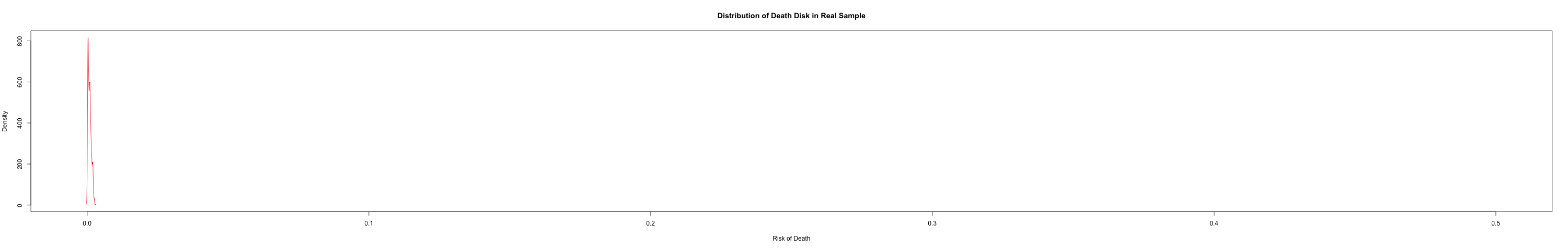
that represents “risk of death” in various occupations. Now let’s assume that nature defines some true function linking “risk of death” to wages, and the function is arbitrarily complicated:

y_i = \alpha + \frac{(100x_i + 3^{x_i})}{1-x_i} + \epsilon_i

There’s nothing special about the function, other than that I (acting as ‘nature’) defined it myself. It also has a nice asymptote at x= 1, meaning that the limit from the left \displaystyle \lim_{x \to 1 -} f(x) = \infty . This comes from the denominator (since dividing by 0 is undefined), and could match some intuition about nobody accepting any reasonable wage for a risk x \approx 1. The error term  \epsilon_i we will assume to be normally distributed with expectation of zero.

With this function in hand, we can randomly generate some values for x that could reasonably be risks of death; in this case, for ease, x \sim Unif(0,1)
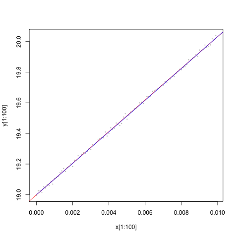
, meaning uniformly distributed on the interval 0 (risk=0%) to 1 (risk=100%).

If we fit the linear model to the full data (because this data is costless, let’s say n=10,000), we’d see pretty quickly that regressing y on x is a terrible idea. The estimated coefficient on risk of death is significant (with 10,000 observations it’s hard not to get ‘significant’ coefficients; see here and here); but the plot of predicted values  \hat{y}  against y make it pretty obvious that the model misses the mark:

Y_yhat

Here’s the problem: we don’t have the full data. Nobody accepts jobs where the risk of death x \approx 1 , or really anywhere near it. The highest occupational risks seem to have ~120 deaths per 100,000 workers. The data my friend was given for his homework, similarly, had the following risk density (and for amusement, see here for perspective):

Density of “risk of death” in the real data given with a problem set.

Density of “risk of death” in the real data given with a problem set.

So, for verisimilitude, let’s refit the model using only a small subset of the data from the low-end values of x, say those for which 0<x<0.01. Now things get frighteningly fun…

Again, the coefficient estimate is significant, but this time there’s nothing in the residuals that give us pause:

These residuals look pretty normal, don't they?

These residuals look pretty normal, don’t they?

In fact, there’s nothing to point out exactly how wrong our model is! For example, check out this image which shows the “true” line and the linear fit line. You can’t distinguish one from the other. In this restricted sample, the root mean squared differences between the linear fit and the true model is only 0.002, compared to more than 13,000 between the true versus linear fit values in the full data.

How bad could this possibly be? Well, let’s plot the true function in black and the linear fit in grey:

value_life2

Well, as it turns out, we can be really, really far off.

Oh, right. We could be really, really far off. Oops.

That was a fun exercise, but so what?

Why does any of this matter? First, consider this fact: I provided us with one possible true function, just for comparison with our linear model. But the actual relationship between risk and wages, to the extent that we can say it exists at all, could take any form.

Second, and this is the scarier part, it’s entirely possible to fit a linear model that looks perfectly acceptable. Within the small subset of data, the linear model is a decent approximation of the truth, at least insofar as we might be interested in predicting wages from risk. 

In extrapolating so far beyond the data, however, we assume that this decent approximation works for all values of x, even with no evidence to support the assumption. There’s no data out at the extremes to tell us how good or bad the assumption is, and thus not only is our model likely wrong, but there is effectively no bound on how wrong we might be.

This isn’t too different from me telling you that the relationship between, say, age and income, can be approximated by a linear model. We’ll include a squared term since income at upper ages tends to fall below our full earning potential. And then – because the model fits so well for data we have! – I’ll extrapolate to give you the expected income for somebody who is 200 years old (it’s less than negative $500,000… someone should stop researchers from improving life expectancy, stat!).

E(income | age=200) ~ <-$500,000... or something.

E(income | age=200) ~ <-$500,000… or something. Scale on the y-axis is categorical from 0 ($0) to 16 ($500,000+). The rug plot at the bottom shows the range of actual data in the CCES. Everything else is just a really bad guess.

Third, no standard ‘fix’ in the econometric toolkit is going to help us. Unlike our toy data, we aren’t ignoring data that might exist out there somewhere. We’re extrapolating beyond data that will likely ever exist. On our subsample, even transforming x with the true function – the function that we’d never know was correct a priori - gives us predictions indistinguishable from the linear fit.

In short, we will never know how wrong we are, in which direction, or how to improve the model.

So what do you propose?

When I pointed out the extrapolation issue to my friend, he responded with some frustration: “We need an estimate, and this is as good a method as any. What do you want governments to do? Guess?”

Well, yea, kinda. I would rather a government or agency guess, and be transparent about it, than use the prediction from a hedonic wage model. The linear extrapolation is just a poorly founded guess anyway, since the method was not designed nor is it suited to the question at hand. Masking it as some scientific method for defining a quantity of interest gives it an air of authority that it doesn’t deserve.

To put it another way, I can buy a car to get us from New York to London. But hey, at least I bought a vehicle of some variety, right? Except that we’ll both drown, and you’ll wish you hadn’t trusted my whole “look, it’s a fancy machine” argument.

Now, I don’t have a better alternative at the moment. Asking people seems silly, and besides, that could also result in dumb linear modeling. Guessing isn’t satisfactory. So what to do?

Well first, please stop defining everything as a regression problem. As a wise man should never have had to write (but did): “Linear regression is not the philosopher’s stone.” Let’s stop treating it like one.

And second… wait, I’ve written 1,500 words and – if you’re still with me – I owe it to the reader to stop.  Also, I don’t have an answer right now. I leave that open to intrepid readers. E-mail or comment, and maybe there’s a follow-up post in the near future.

Americans Secretly Oppose Gay Marriage

If you’ve struggled to find humor in politics recently, rejoice. At least the skewed-polls people are still around.

gaydensity

Yesterday, Chris Stirewalt blogged for Fox News that polls overstate support for gay marriage. Voicing a similar belief, leading social conservative Gary Bauer showed little concern over public opinion, telling Fox’s Chris Wallace:

“No, I’m not worried about it because the polls are skewed, Chris. Just this past November, four states, very liberal states, voted on this issue. And my side lost all four of those votes. But my side had 45, 46 percent of the vote in all four of those liberal states.”

As with many fallacies, there’s an iota of truth here. Stirewalt draws on work by New York University political scientist Patrick Egan that shows that late-season polls typically overestimate support for gay marriage compared with the election returns.

I don’t really have a problem so far. A Pollster article by Harry back in 2009 made a similar point and explored some ways to improve predictive models. The gap between pre-election polls and election returns, in other words, is well documented.

So, the polls are skewed…

Here’s where I depart from most interpretations of this observation. The poll-vote gap does not necessarily imply that the polls are “skewed.” Could it? Yes. But it doesn’t need to. I suspect a good bit of the bias comes from who votes not how they vote.

Stirewalt argues that the polls are skewed and mainly blames social desirability bias. In this line of reasoning,  respondents do not want to admit opposition to gay rights for fear of social judgement; instead, they act supportive but cast their secret ballot against. In other words, the “true” level of support is systematically lower than the polls show.

What’s crazy to me is that Stirewalt, even after basing his entire argument on Egan’s research, ignores the part where Egan dismisses social desirability as the primary cause of the polls’ inaccuracy. And Egan couldn’t be much plainer about it: “On the whole, these analyses fail to pin the blame for the inaccuracy of polling on same‐sex marriage bans on social desirability bias” (p. 7)1.

What seems most likely is that pollsters haven’t figured out how to calibrate their samples to match the turnout. Ballot measures only attract at least moderately engaged observers. On an issue like gay marriage, it’s not surprising that some who ostensibly support gay rights aren’t nearly as motivated as those who have social, cultural or religious objections to it. The polls may decently represent the “true” proportion of citizens who support gay marriage, but not the class of voters who cast a ballot on the issue.

We’re Missing the Point

But far, far more importantly, any potential skew in the polls misses the true point here. Let’s assume that the polls are skewed, and that “true” support for gay marriage is actually seven points (best guess from the Egan research) lower than the polls say.

So what?

gaytherm

Those who invoke public opinion aren’t really that worried about crossing 50 percent. Even if the polls exaggerate support for gay marriage, the trend favors the equal rights argument. The above figure2 shows general sentiment (“thermometer” scores) toward gays and lesbians in the American National Election Study3This figure by Nate Silver shows a similar rise in support for gay marriage. And this figure from Gallup shows a widening gap favoring general rights for gays and lesbians.

In this light, even yelling “Skewed Polling!” doesn’t change the fact that support for gays and their ability to marry is rising steadily.
blackdensityNow I know that race and sexual orientation are not the same, but there are some similarities between the above kernel density plot and the one at the top of the post. In general, support for rights and general sentiment co-evolve. Sentiment toward black Americans has increased even in the post-Civil Rights era. We see a smaller but similar “swell” in sentiment for homosexuals, with every reason to think it will continue on its current trajectory.

Even if support today is really say, 51 percent instead of 58 percent, it’s much higher than it used to be.

Could we just be getting more politically correct, instead of more ‘liberal’, on gay rights? Sure, but the green line in the time series doesn’t show any real change in the rate of respondents opting out. No, young people are coming of age with a more permissive view on this issue.

Skew or no, the trend speaks for itself.

Notes:
[1] Now, as a brief aside, Egan’s first test for social desirability bias makes no sense to me. I can imagine plenty of reasons why a state’s gay population wouldn’t predict the poll-election gap. But the second test is much stronger: despite the social acceptance of LGBTs growing, the gap has become smaller. All in all, I’m sure social desirability is part of the story, but it’s most likely not the primary factor.

[2] The figure shows thermometers scaled on the interval [0, 1], as well as the proportion of respondents who respond to gays warmly (therm > 0.5), cooly (therm < 0.5), and those who opt to not answer. Confidence bands are generated using 1,000 bootstraps from the survey margin of error. The margin around “skip” seems odd, but for convenience I’m treating “skip” as an expression of a desire to not answer, and thus as a random variable in its own right.

[3] The ANES, funded by the National Science Foundation, could be at risk thanks to recent Congressional targeting of political science. Contact your representatives in Congress because (I promise!) most scholars use the study for more consequential research than I.

The Democratic Left Ascendant

Elections have consequences, and many of those consequences are — well, consequential. But every election brings endless speculation that this election was the election – the realignment, the death of the losing party, the upending of the current political era.

The midterm election in 2002 was “a disaster” that crushed Democrats and forced them, if they were smart, to tack toward the center. President Bush’s 2004 victory only solidified the Democrats’ fate. Until, of course, the 2006 and 2008 elections marked a resurgent Democratic left and the ultimate failure of the conservative project. Until 2010… well, you get the point.

Some of these speculations are more well-founded than others. In his last post for the New York Times’ Campaign Stops blog, Columbia professor Thomas Edsall asks if “Rush Limbaugh’s country [is] gone“. Pointing to some polling data and discussions with prominent Democratic pollsters, Edsall suggests that a new left-leaning electorate is emerging from the ashes of the political polarization and financial crisis of the late 2000s.

The argument is interesting, but we could probably reconsider some of the evidence he points to.

Mr. Edsall, for example, discusses a Pew Research survey showing that young voters, African Americans and Democrats with a favorable impression of socialism. This could mark the emergence of a potent leftism that could forever transform the American political landscape.


Source: Thomas Edsall, New York Times Campaign Stop blog.


The numbers say something else to me. I’m not sure that any more Americans would support actual socialist policies today than would have two or ten years ago. What likely changed is the affective charge of the term.

Take, for example, dissertation research by UNC’s K. Elizabeth Coggins on the emergence and relative decline of “liberalism” as a political identity. A paper (pdf) by Coggins, coauthored with Jim Stimson, explores how individuals attach meaning to such labels as “liberal” and “conservative”, and “how widely popular liberal policies like Social Security, Medicare, and workplace safety came unhinged from the ideological label which defines them. ”

If liberalism could come unhinged from its ideological content, it stands to reason that the same could happen to socialism. Over the past several years, many conservative commentators and Republican leaders have called President Obama’s policies “socialism”; and if the term might rally voters on the right, it may too help to redefine how many liberals think of “socialism”. If liberals begin associating Obamacare and higher taxes on top income earners as socialism, they may be more inclined toward the ideology.

The rest of Mr. Edsall’s case rests on striking differences between liberals and conservatives on an array of policy proposals. The gaps are stark, but they are not necessarily new. Self-identified liberals and conservatives have long held distinct views on an array of policy issues from education to welfare spending.

Liberal and Conservative Attitudes toward Increased Welfare Spending. (ANES Cumulative Data FIle)

Liberal and Conservative Attitudes toward Increased Education Spending. (ANES Cumulative Data FIle)


True, ideologically-leftist voters attach more consistently to the Democratic party, and conservatives self-identify more as Republicans, than in decades past. This upholds a partisan sorting hypothesis, but not to any particular narrative of either left- or right-of-center ideologies emerging as dominant.


Liberalism and Conservatism Over Time. (ANES Cumulative Data FIle)


In fact, there is little sign that the American electorate is moving either left or right. Macropartisanship is known to shift over time in response to economic conditions, the occupant of the White House and political shocks. Surely Republicans will want to rethink their strategy of appealing to minorities and to a lesser extent women; but it’s unlikely that Republicans will have to learn to live with an emerging leftism in the American electorate.

It’s Good to be Average

Last week, we examined the accuracy of several presidential forecasts. For those familiar with statistics and probability theory, the results proved unsurprising: the forecasts came reasonably close to the state-level outcomes, but the average forecast outperformed them all.

Put another way, the aggregate of aggregates performed better than the sum of its parts.

This year’s Senate races provide us another opportunity to test our theory. Today, I gathered the Senate forecasts from several prognosticators and compared them to the most recent Election Day returns. As before, I also computed the RMSE (root mean squared error) to capture how accurate each forecaster was on average.

We must note one modest complication: not all forecasters posited a point-estimate for every Senate race. Nate Silver put forward a prediction for every race; but Sam Wang of Princeton University only released 10 predictions for competitive races.

We accordingly compute two different RMSEs. The first, RMSE-Tossups, only computes the RMSE for those races for which each forecaster put forward a prediction. (There are nine races that fall into this category: Arizona, Connecticut, Massachusetts, Missouri, Montana, Nevada, North Dakota, Virginia and Wisconsin.)

The other calculation, RMSE-Total, shows each forecaster’s RMSE over all predictions. Wang, for example, is evaluated by his accuracy on the ten predictions he made; while Silver is evaluated on all 33 races.

Forecast RMSE-Tossups RMSE-Total
Wang 4.7 4.6
Silver 5.1 8.0
Pollster 3.8 5.8
RealClearPolitics 5.4 5.1
TalkingPointsMemo 3.9 8.0
Average Forecast 4.4 5.4

The numbers in the above table give us a sense of how accurate each forecast was. The bigger the number, the larger the error. So what can we learn?

Alas! The average performs admirably yet again. It’s not perfect, of course; for some races, there are precious few forecasts to average over: Delaware, for instance, has only the 538 prediction.

To begin accounting for this, we weight the RMSE by the share of forecasts used to compute the average. If we limit our evaluation of the average to only those races with three or more available forecasts, the RMSE drops to 4.8.

What else emerges from the table? For one, the poll-only forecasts — especially the Wang, RCP and Pollster forecasts — perform better than Nate’s  mélange of state polls and economic fundamentals.

North Dakota, where Democrat Heidi Heitkamp bested Republican Rick Berg, provides a case in point. Pollster and RealClearPolitics both predicted a narrow win for Ms. Heitkamp. The 538 model considered the same polls upon which Pollster and RCP based their predictions; but the fundamentals in Mr. Silver’s model overwhelmed the polls. As a result, the 538 model predicted that Mr. Berg would win by more than five points. [See Footnote 1.]


In sum, however, all of the forecasts did reasonably well at calling the overall outcome. We can chalk this up to another victory for (most) pollsters and the quants who crunch the data.

1. Addendum: In the original post (text above is unchanged), I argued that Mr. Silver’s economic fundamentals pushed his ND forecast in the wrong direction. This undoubtedly contributed to his inaccuracy in North Dakota, but it wasn’t the main factor. As commenters pointed out, Silver’s model was selective in the polls it used to predict the outcome. As of the last run of the model, Silver’s polling average lined up fairly well with RCP (Berg +5) but not with Pollster (Heitcamp +0.3). Mea Culpa.

Aggregating the Aggregates

Thanks to data compiled by Kevin Collins at Princeton, we can examine the accuracy of some of the state-level forecasting models. Nate Silver’s 538 model performs marginally better than the pack. But the best predictor: an average of the forecasts.

To assess accuracy, we calculate the Root Mean Squared Error. To do so, we take the actual result in state i,  R_{i} , and a forecaster’s prediction in state i,  P_{i} , and calculate:

 \sqrt{ \frac{1}{n} \sum_1^n (R_i - P_i)^2 }

As you can see, higher values indicate that the forecaster made bigger errors. Put another way, the number shows us how badly each forecaster missed on average. 

Alex Jakulin, a statistician at Columbia, helpfully pointed out that a more useful metric may be the RMSE weighted by the importance of each state. We would expect misses to be larger in small states and should correct for that. Accordingly, we present the RMSE for each forecaster, and the RMSE weighted by the proportion of electoral votes controlled by each state.

Forecast RMSE Wtd RMSE
Silver 538 1.93 1.60
Linzer Votamatic 2.21 1.63
Jackman Pollster 2.15 1.71
DeSart / Holbrook 2.40 1.79
Margin of Σrror 2.15 1.98
Average Forecast 1.67 1.37

All told, the forecasts did quite well. But look at what worked better: averaging over the forecasts. This makes good statistical sense: as Alex points out with a fun Netflix example, it makes more sense to keep as much information as possible. In a Bayesian framework, why pick just one “most probable” parameter estimate, instead of averaging over all possible parameter settings, with each weighted by its predictive ability?

During the Republican primaries, Harry Enten published a series of stories on this blog doing precisely that; and then, as now, the “aggregate of the aggregates” performed better than any individual prediction on its own.

On the whole, all the forecasting models did quite well. As the figure above shows, critics of these election forecasts ended up looking pretty foolish.

I only now wonder if the 2016 will see a profusion of aggregate aggregators; and if so, how much grief Jennifer Rubin will give them.


How Well Did Polls Do?

The polls, and the forecasters using them, performed pretty well. Harry Enten posted for the Guardian this morning about the overall success of pollsters in the 2012 cycle, and John Sides put up this great post/figure over at The Monkey Cage. (The figure was also picked up by Ezra Klein.)

I wanted to see the estimated error margins around the final pollster predictions. So here’s my take with 95 percent confidence bands:

The figure shows the difference in the predicted and actual Obama margin. Positive numbers mean that the pollster overstated Mr. Obama’s margin of victory; the negative implies the inverse.

Almost all of the polls came within a reasonable distance from the outcome. In fact, most contained the true outcome in their margins of error.

Updating Your Prior Beliefs

We’re not live-blogging the presidential race, but here is an interesting tidbit:

There is not much to update in the model, but we can update our expectations given current returns. Put another way: we can ditch simulations with results we know to be incorrect.

By updating our beliefs, Mr. Romney’s chances of winning drop from 32 percent to only 12 percent. As you can see in the figure, Mr. Romney’s distribution of electoral votes has become much more certain (as we would expect), but he’s lost most area under the curve to the right of 270.

The door on Mr. Romney’s probability of winning is closing, and quickly.


Back to Fundamentals

As we published yesterday, the Margin of Error forecast predicts Mr. Obama to secure reelection with 303 electoral votes to Mr. Romney’s 235. This translates roughly into a 68 percent chance for Mr. Obama to win, leaving a nonnegligible 32 percent chance of an upset victory by Mr. Romney.

One of the more interesting elements of the model is that it’s agnostic to state-level polling. Most of the highly-trafficked forecasting models (the gold standard is Nate Silver’s 538 model) use various methodologies for aggregating state- and national-level polling.

The MoE forecast, on the other hand, uses very few variables. The national popular vote is predicted using late-season approval data; the state-level votes are forecast using (a) previous election results; (b) August-November change in unemployment; (c) home state advantage; and (d) a regional dummy variable. No polls.

Despite the stark difference in methodology, the forecast comes in well in-line with most quantitative models. The most notable gap between our model and many of the poll-aggregation models is, in fact, that ours makes a far more conservative prediction of uncertainty.

So, what’s the deal with this fundamentals-based model, anyway? In my opinion, a fundamentals-based forecast brings some distinct advantages and disadvantages.  Continue reading